This branding design project was done in a group of 2 elements for an academic contest for the city of Castelo Branco.
My role was to create all the creative parts, starting from the ideas to the visual identity of all the elements we had to create. The main objective was to create a branding design and campaign for an ice cream franchising shop that was planned to open in 2020.
After planning the values, mission and other important aspects of the branding, we started to sketch to be able to visualize and test the elements created.
As a group we wanted to give a strong idea of adaptability and alternative for the visual identity. Both of these values had something in common.
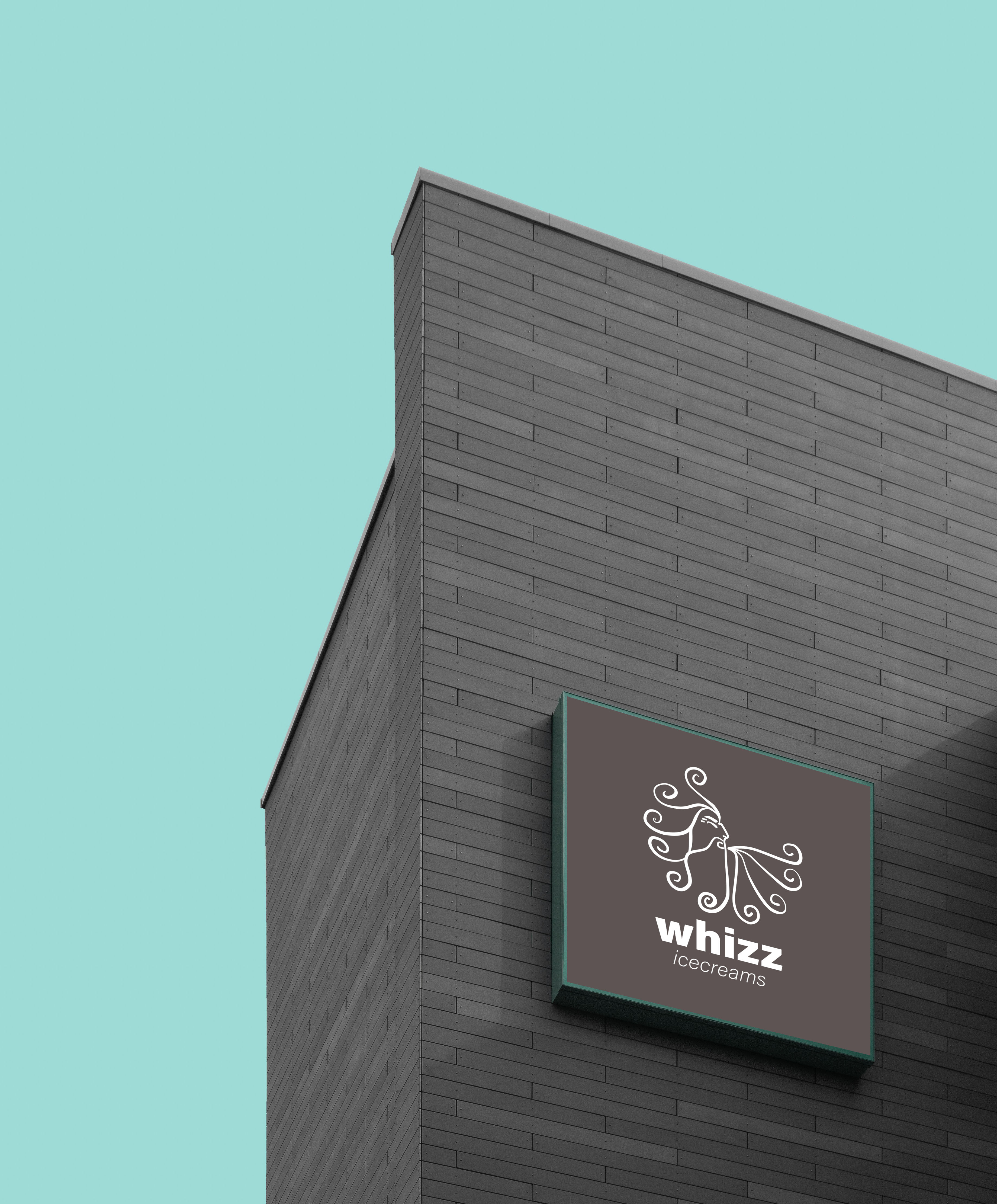
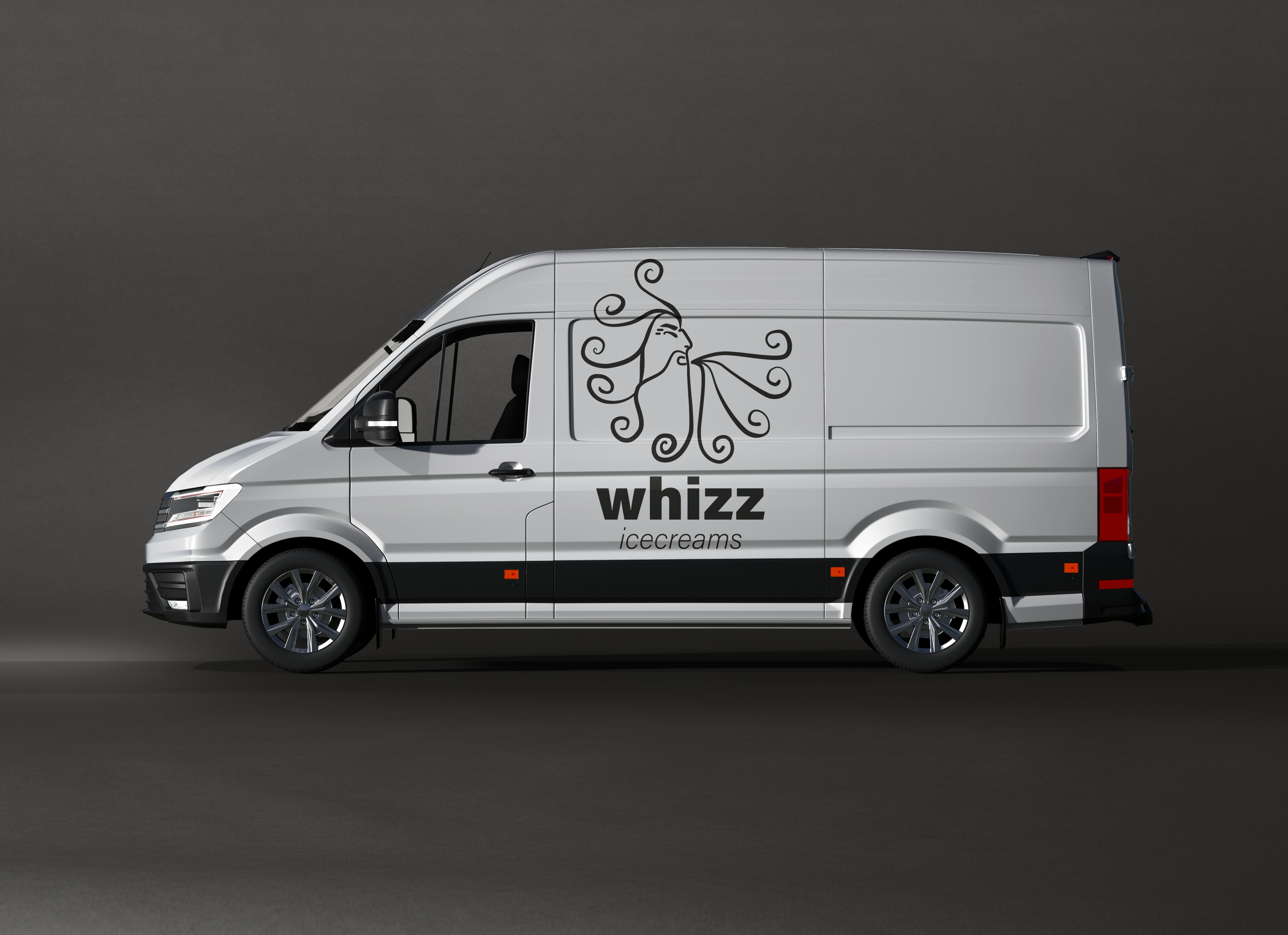
The idea of adaptability means that the company could sell the product in any place, parks, pools and during other events. Be it in a shop, truck, or in an ice cream cart for narrower places.
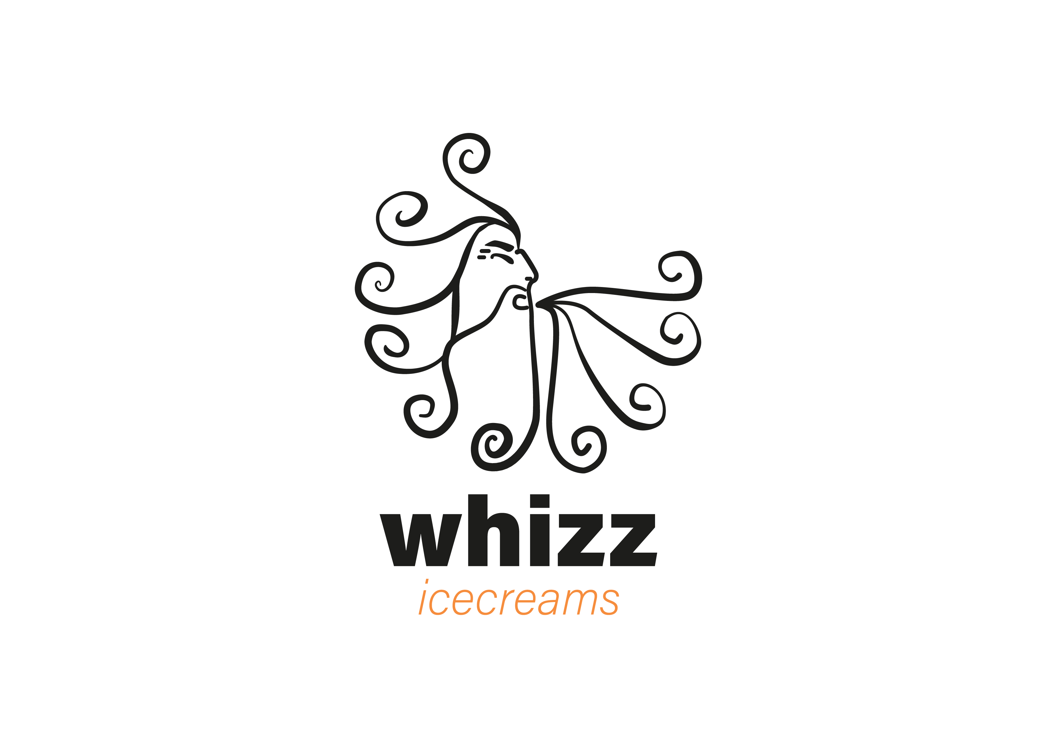
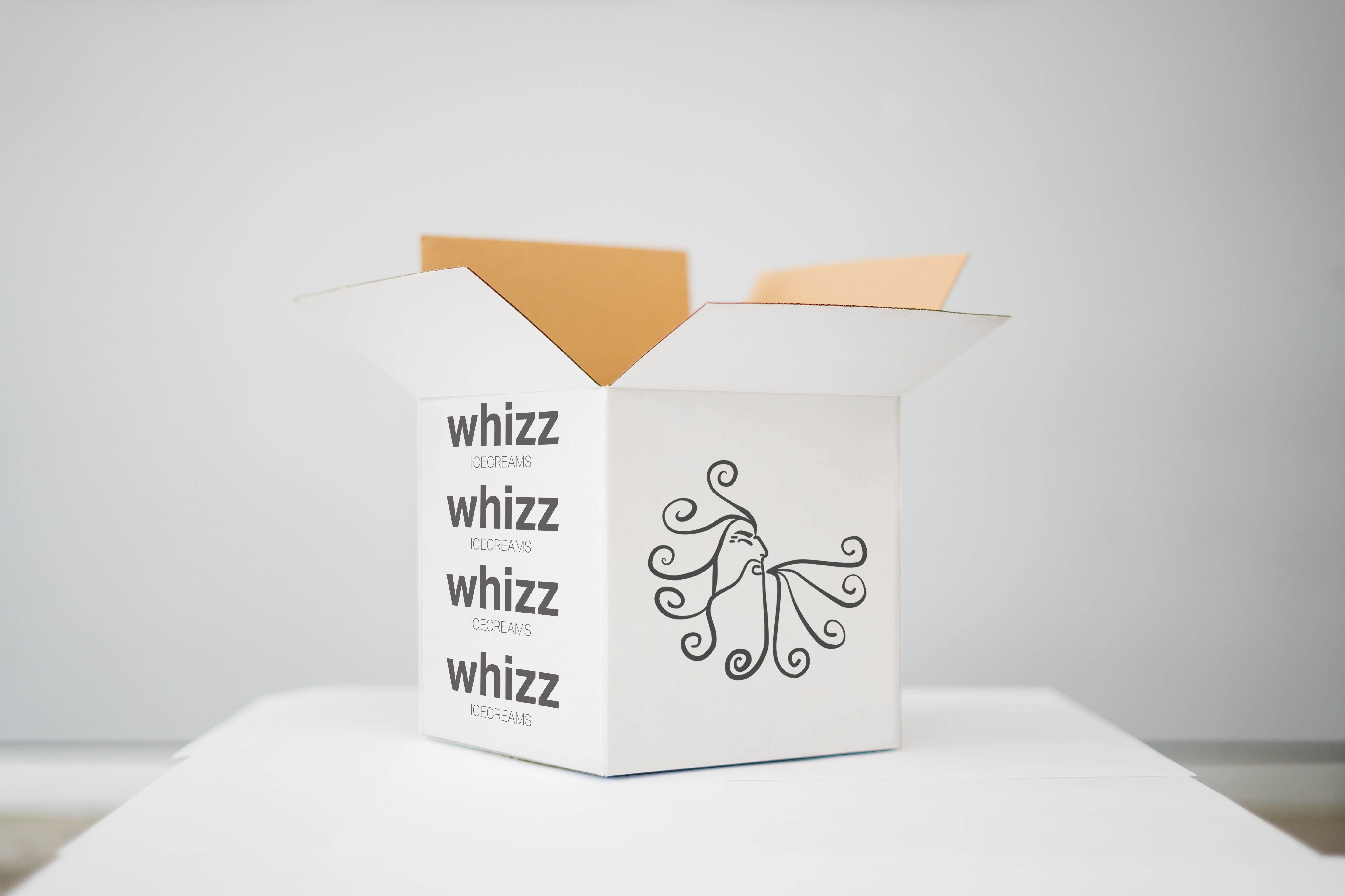
The symbol present in the LOGO is Cecius (Kaikias in Greek), the god of the northeast wind. This wind direction represents a constantly increasing development for the company and the wind also gives the idea of adaptability and alternativity, can take the best approach in the right moment. The name whizz is also a representation of the sound of the wind (onomatopoeia).