Development4All is a company that specialize in the professional's development such as leaders, directors and commercial managers.
The goal of this project was to create a Logo Design that matches the company's needs, vision, mission and target audience.
Since the company is a specialist in professional development, they need to give the best to have the best development for the company's clients. Their vision is to achieve high excellence results that only high performance teams can achieve.
Their mission is to guide clients to a successful route in their own professional development.
And the target audience are entrepreneurs that are interested in personal and/or their company's professional development.
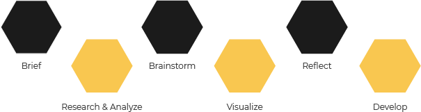
During this phase I did research on other companies in the same industry to understand how they act and visually communicate, including their logo. After doing the research I started to analyze the research and the client's briefing to find keywords/important information that could be used during the 3th phase.
This company's work is focused on people's personal or company's development, so it is important to show that idea as best as possible.
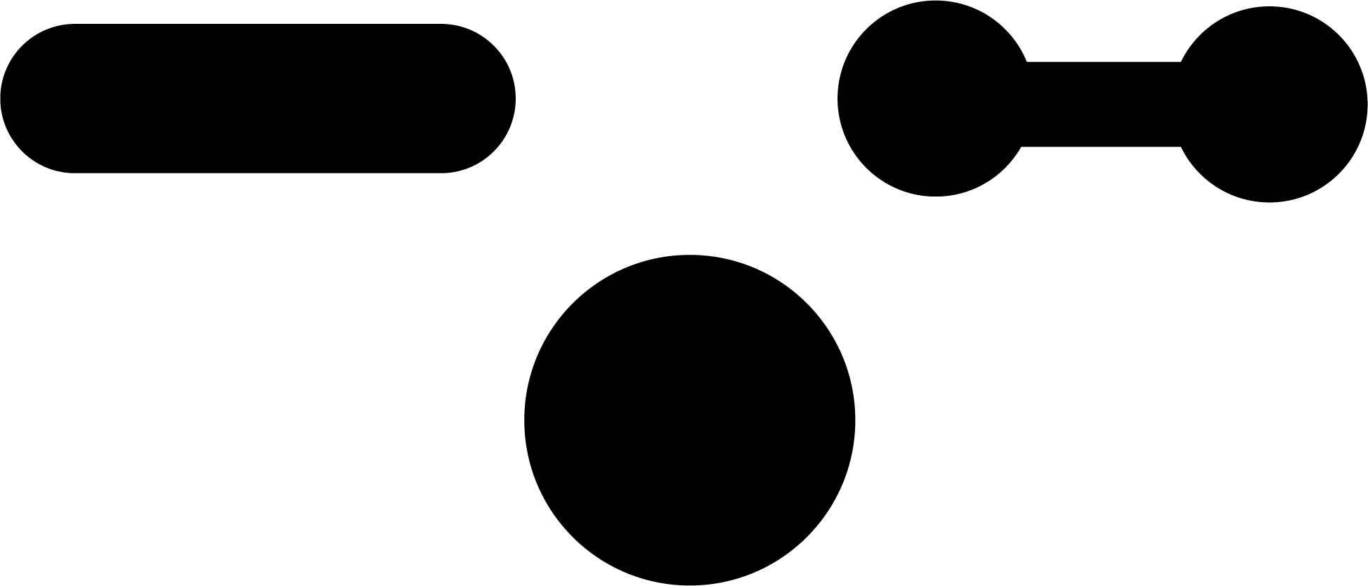
After brainstorming I came up with 4 important keywords: Development, Excellency, Performance, and Success. Those 4 keywords should be in harmony with the idea of people. There are 3 symbols/shapes that I choose to show the values of the keywords.
The circle, the rectangle, and a genetic like symbol that combines the circle and rectangle.
These 3 shapes will visually give the keyword ideas.
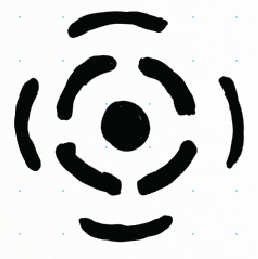
During the first sketches I tried to combine the idea of the keywords with the shapes and at the same time testing if it transmit correctly the idea.
This concept used the rectangle and circle elements to transmit the idea of people and motion. The center/core is the company and the other elements are the company's clients.
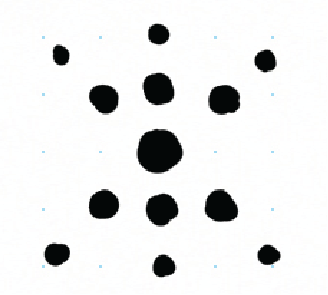
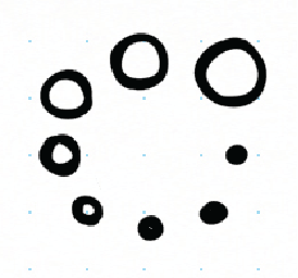
Just like the previous one, this concept uses the same ideas, but with only circles, the idea of a line is indirectly present in the position of the elements.Just like the previous one, this concept uses the same ideas but with only circles, the ideia of a line is indirectly present in the position of the elements.
This last sketch, reinforces the idea of motion and people. People develop with one another.
After meeting with the client to show my concept ideas through the sketches I made, the client wanted to reinforce more the idea of people, so we decided to put more time into the concept before jumping into the next phase.
The best way I could show the idea of people was something more direct, literally using a person like symbol.
I kept sketching, removing the symbols I thought didn't add anything to keep it simple but strong in the eye of the target audience.
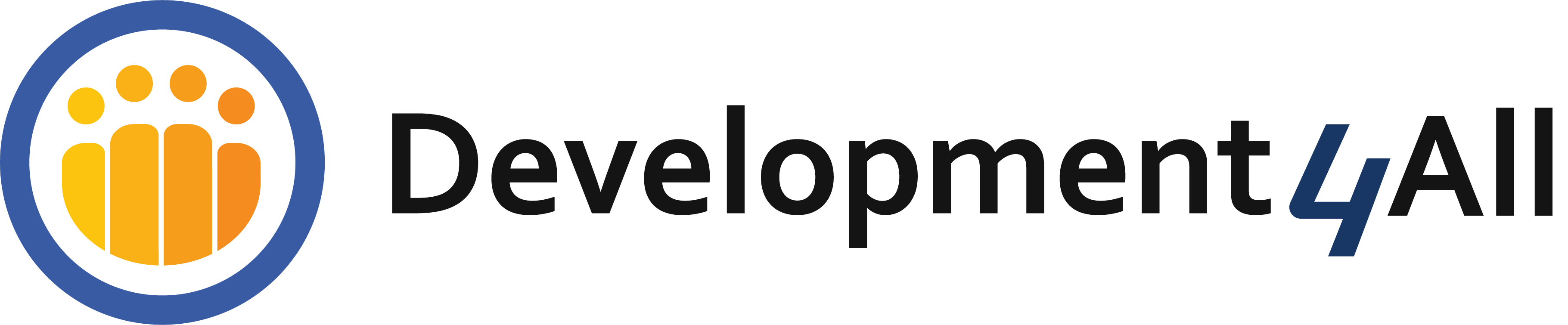
I decided to keep the circle and add the people, 4 of them, to go into the idea of the name, Development4All.
This way the circle gave an idea of a company, union, development with the idea of people, the target audience.
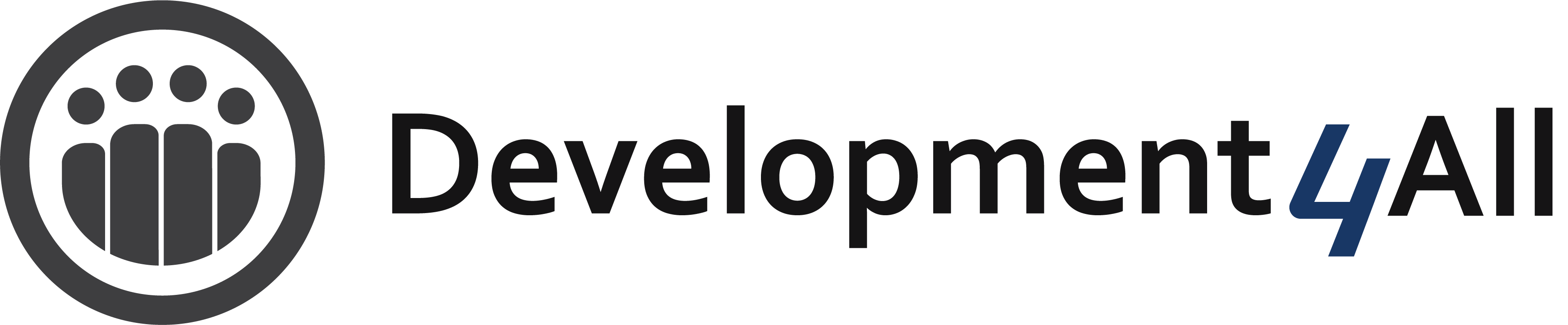
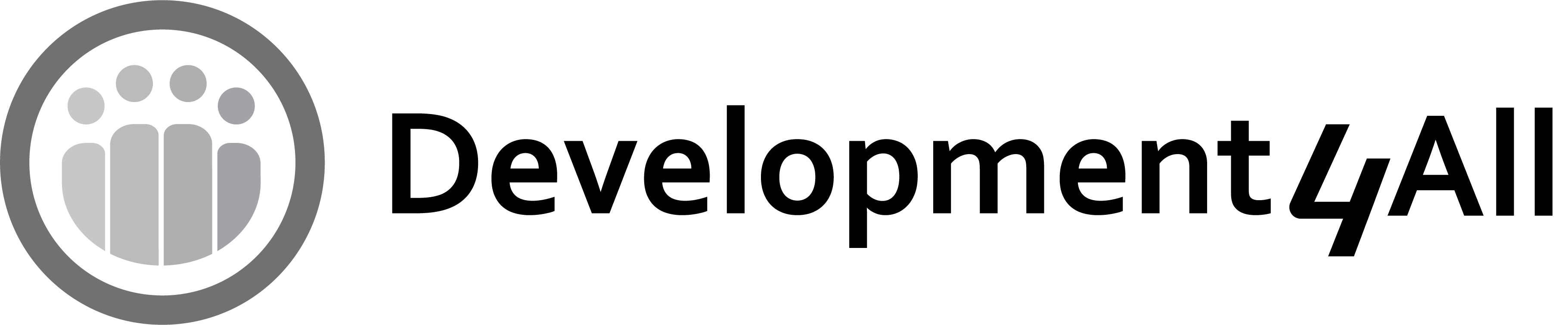
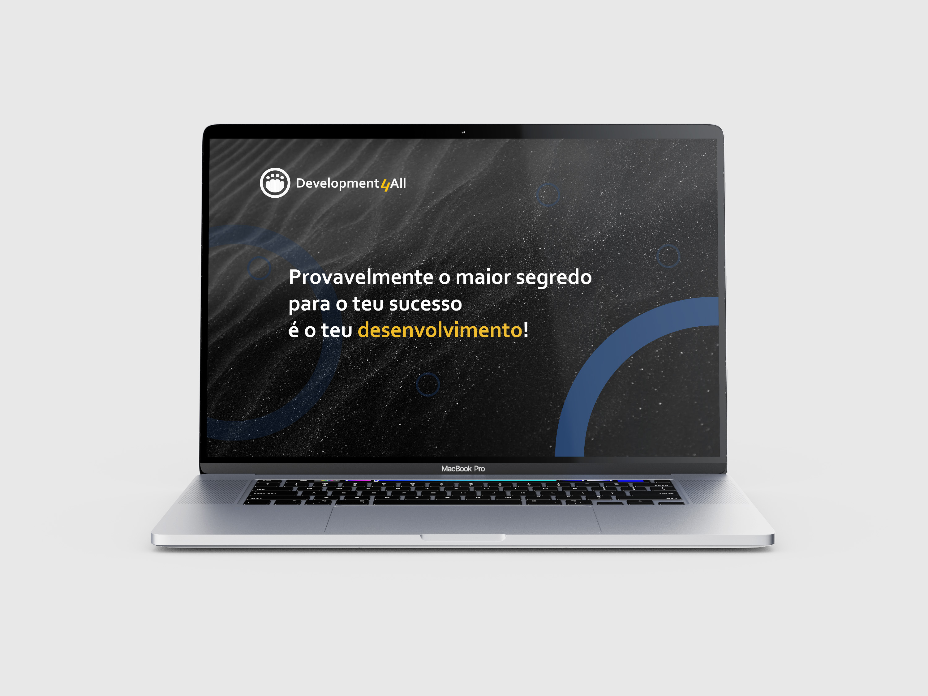
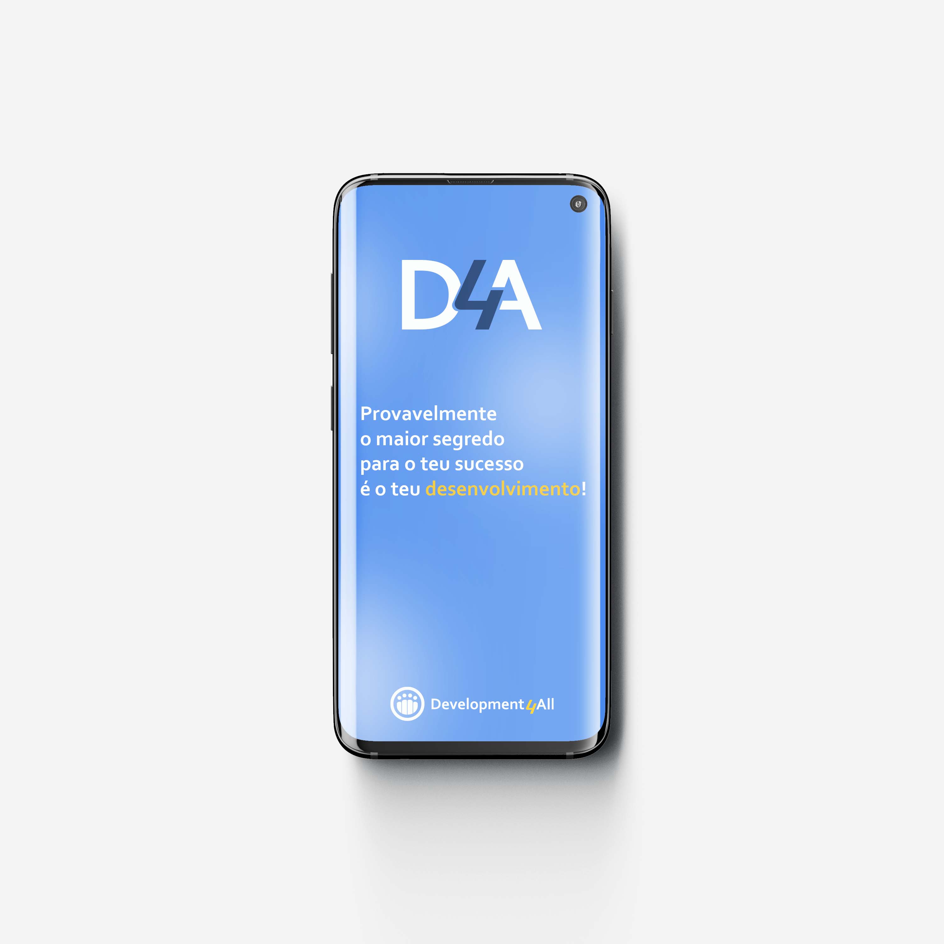
With all the ideas and sketches finalized, the product was ready for the last phase, the development of the vector image and its respective elements. Including documents such as guidelines to help the client use the Logo the right way.
In conclusion, the most challenging phase of this project was the fourth phase because there were many requirements and only some elements could be combined in simple way that would solve the company's needs but after talking with the client and sharing ideas, it started to become more obvious what the better solution was.