FEEL YIN is a company that works in the field of chinese medicine and aesthethic medicine.
Its mission is to treat and cure its patients using natural medicine therapies.
The objective of this project was to create an visual identity and to position the company according to the client's needs, industry and the company's own values.
All the company's branding strategy, target audience, message, objectives and values were defined during the third phase of the process along with the client to make sure everything was ready to take the next step in the project.
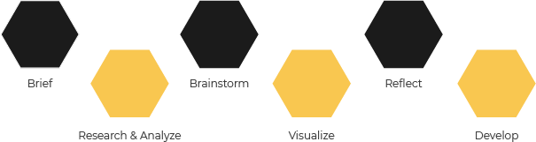
This first phase was crucial to understand the client's need and what the project was about.
I asked the client about the origin of the brand, what is the target audience, the message, objectives, values and other important informations like the services.
After understanding what was intended in the briefing and talking to the client, I started to research similar competition in this industry.
In general, these companies/clinics tend to have a weak identity or even the absence of one.
They don't have a strategy that helps them position themselves in the market in order to distinguish themselves from the competition.
However, there are some that stand out with a good identity that allows them to have a good image with customers and making sure the Brand is easily identified. With this, the best strategy for the visual identity will be a small choice of colors and typography that allows creating contrast between elements without much variety. Create captivating elements throughout the design.
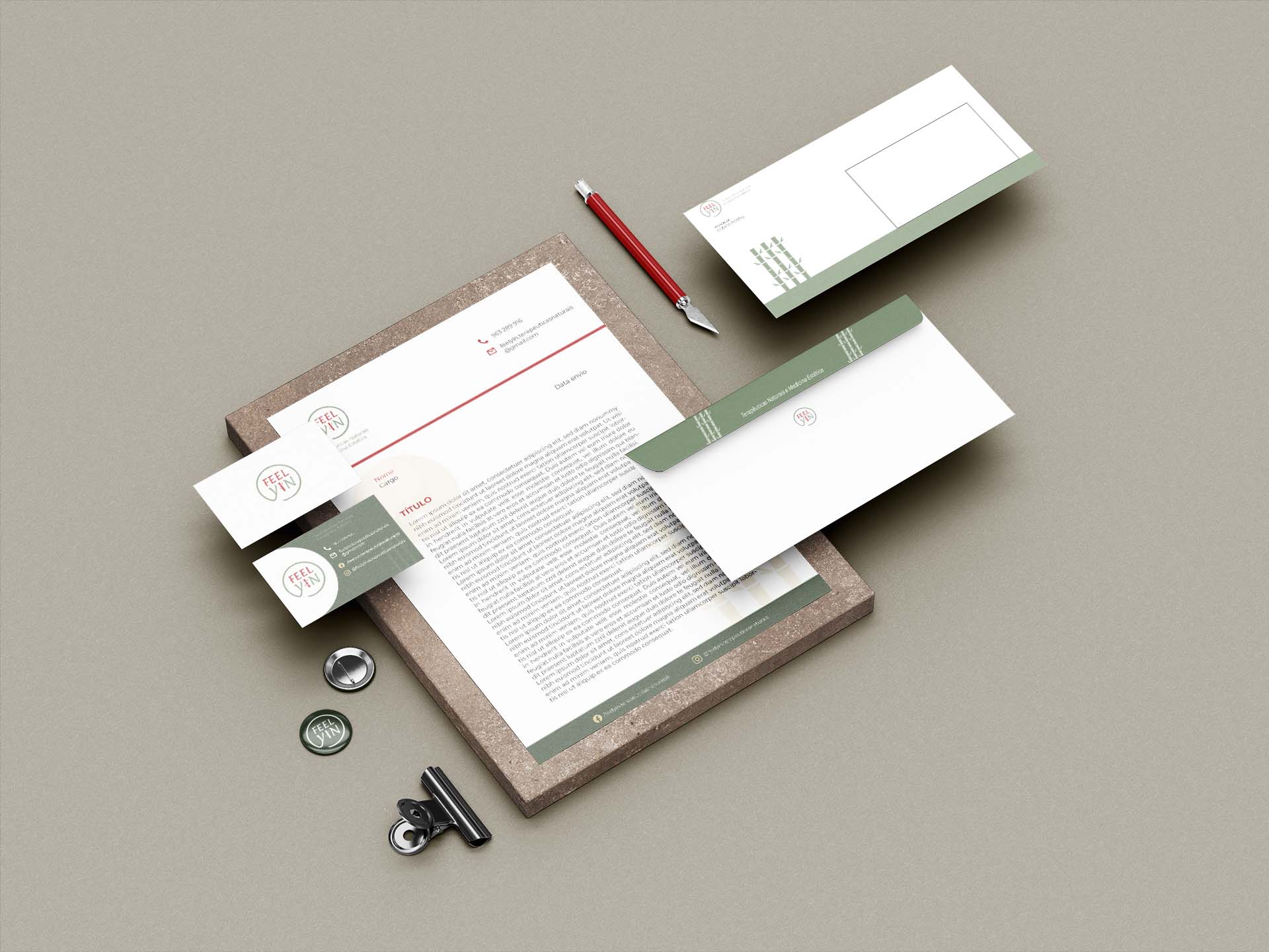
The stationary, all products that embody a company's graphic identity, must remain consistent, follow established visual standards.
The same applies to the interiors of a future branded establishment/office.
After the first and second phase of the process I wrote all the ideas that I gathered while researching the market to understand what has been done and how things work in this specific industry.
This way It was possible for me to be more selective in my decisions.
The idea wasn't to follow the same path as other companies from this field/industry but instead It was to be as unique as possible in both strategy and visual identity without leaving too much the idea of being a medicine company.
It took many approaches to get near the client's vision and what I thought worked.
In the Visual Identity many paths were visualized but only some really were in the right direction on what was defined in the strategy.
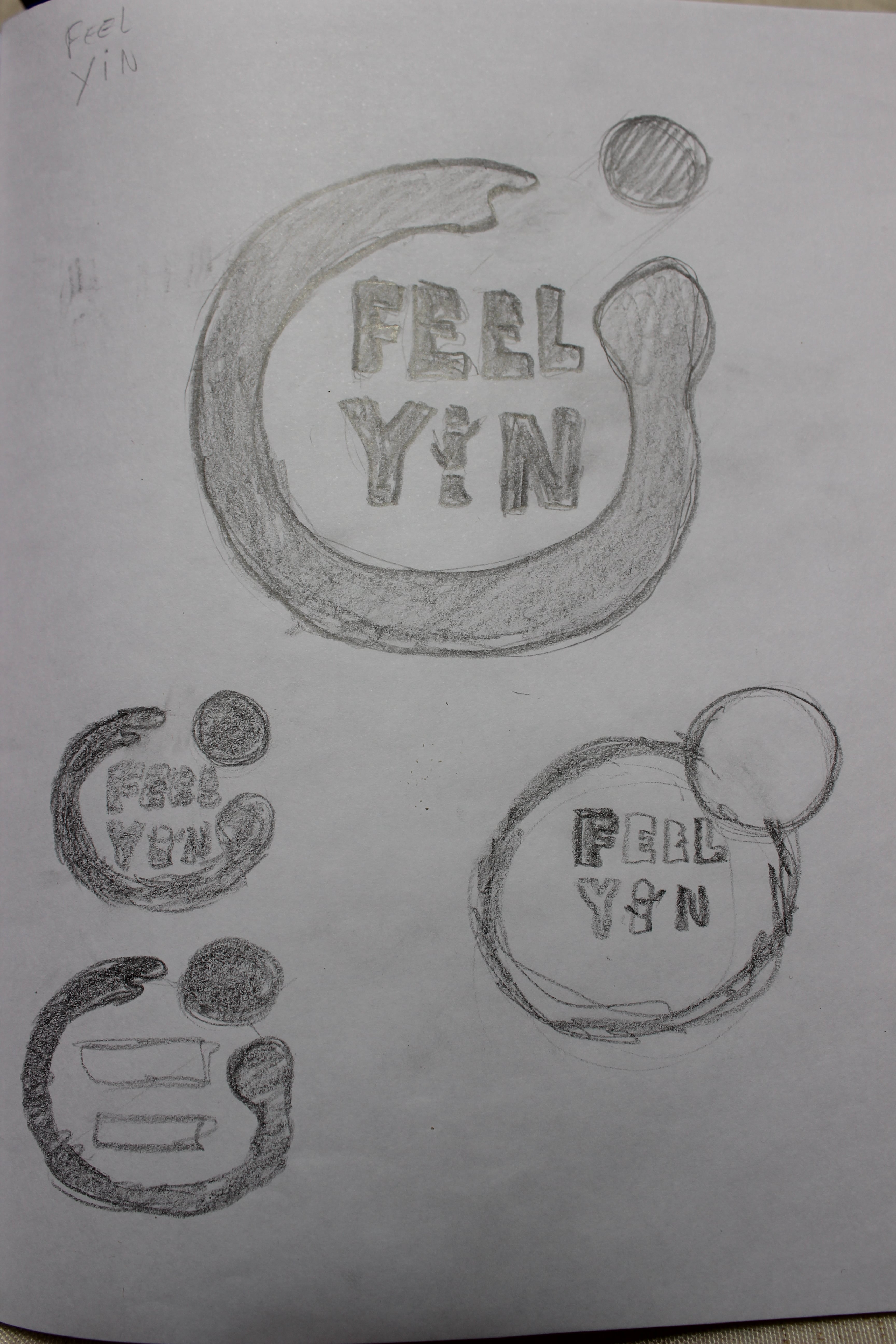
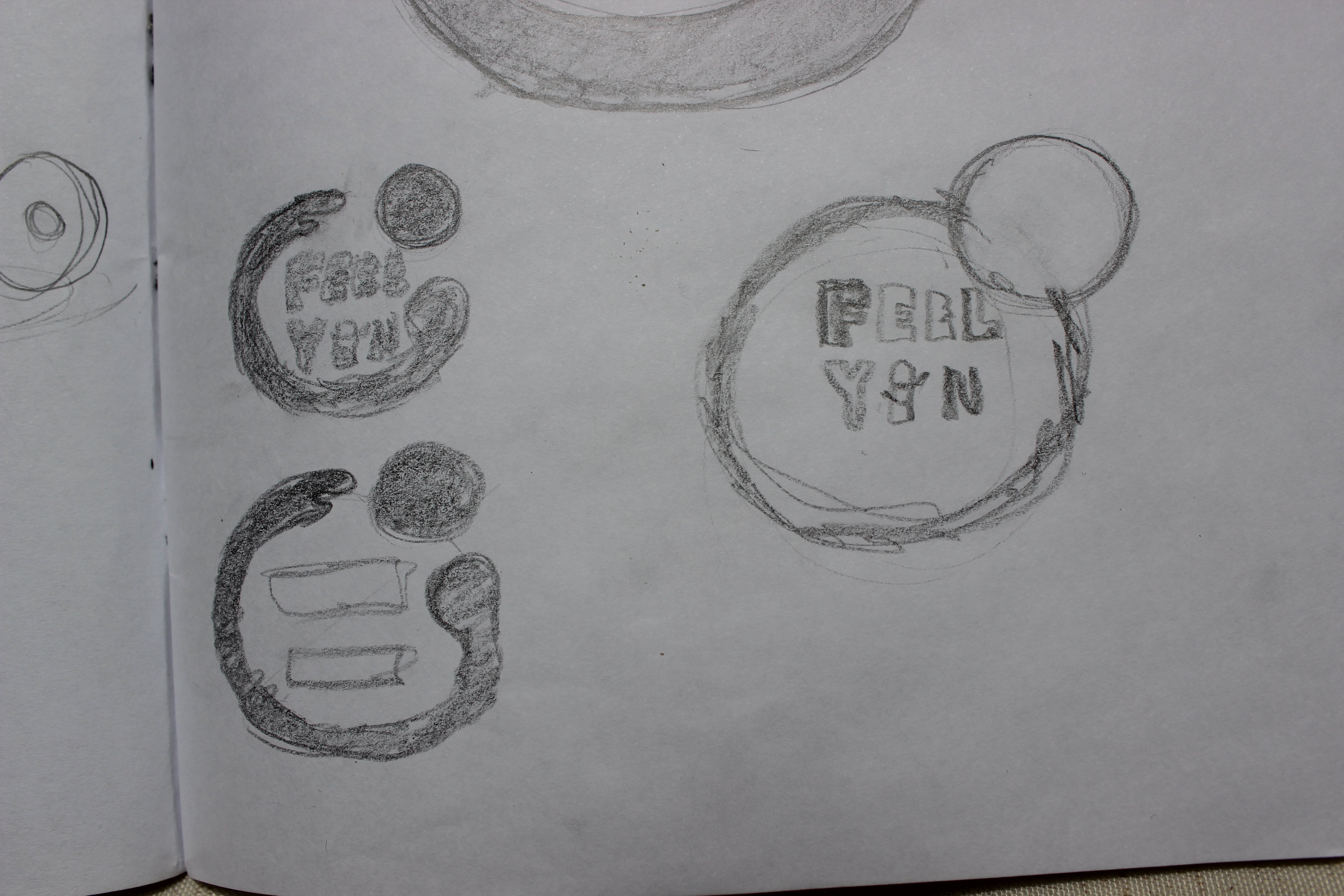
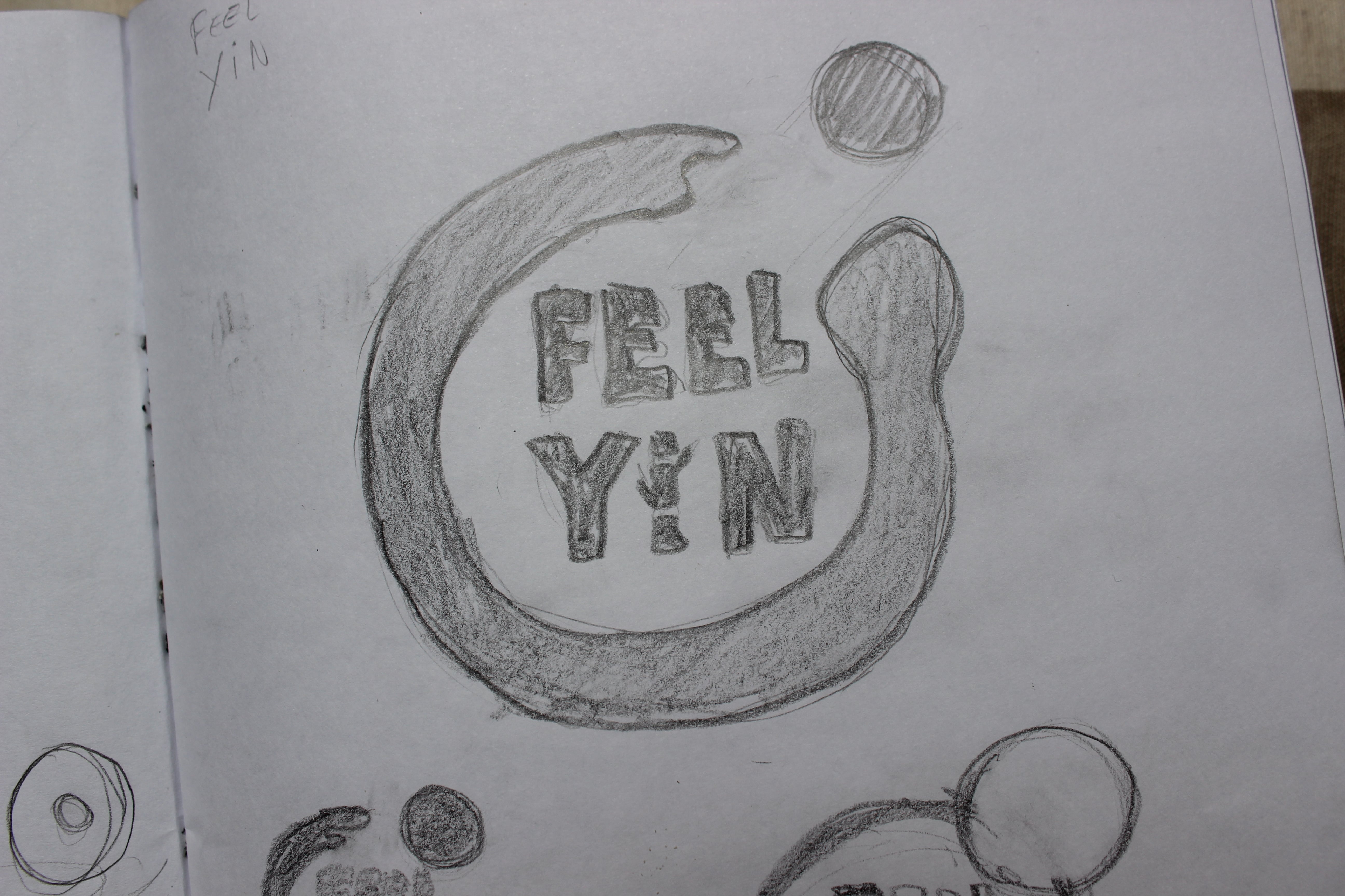
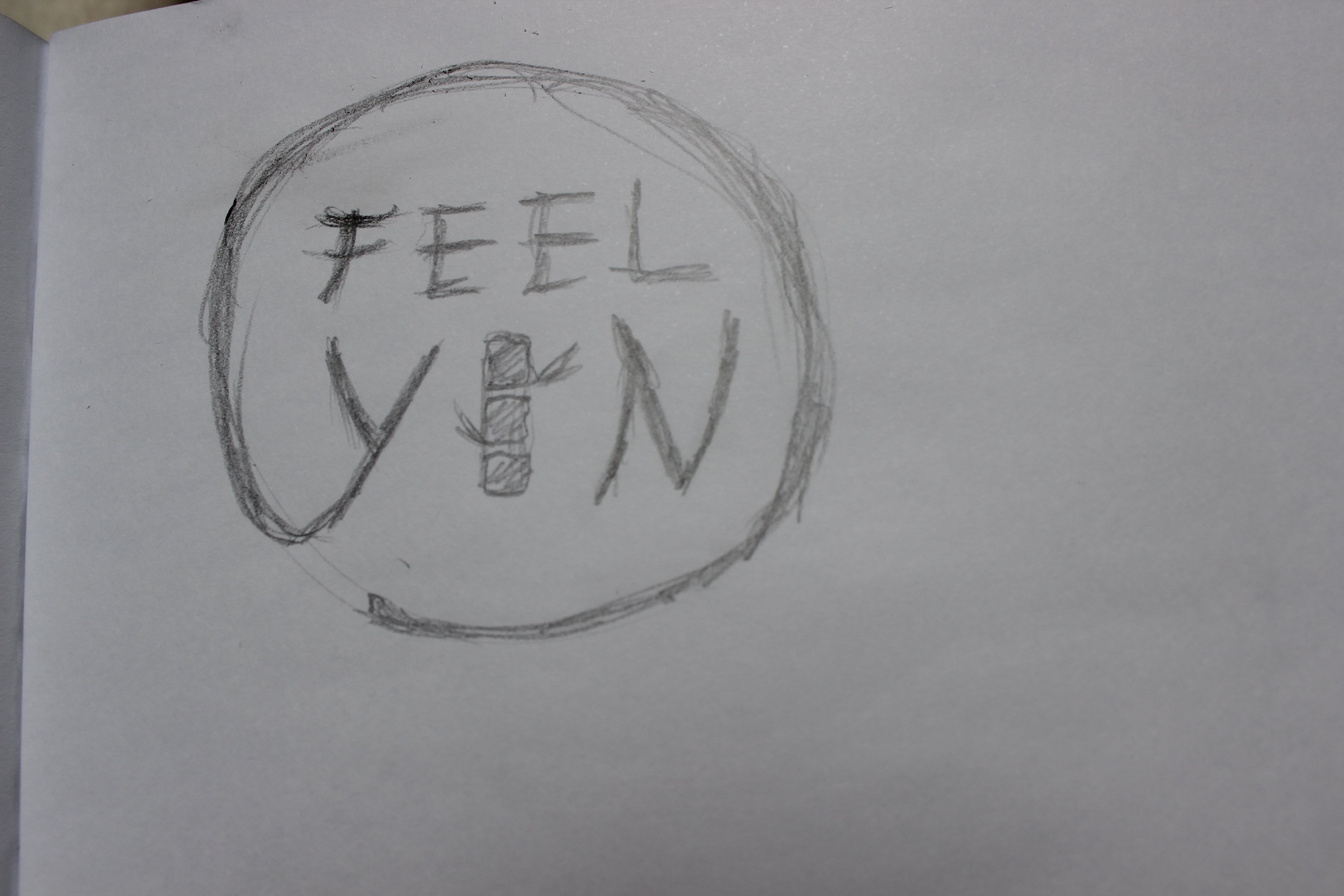
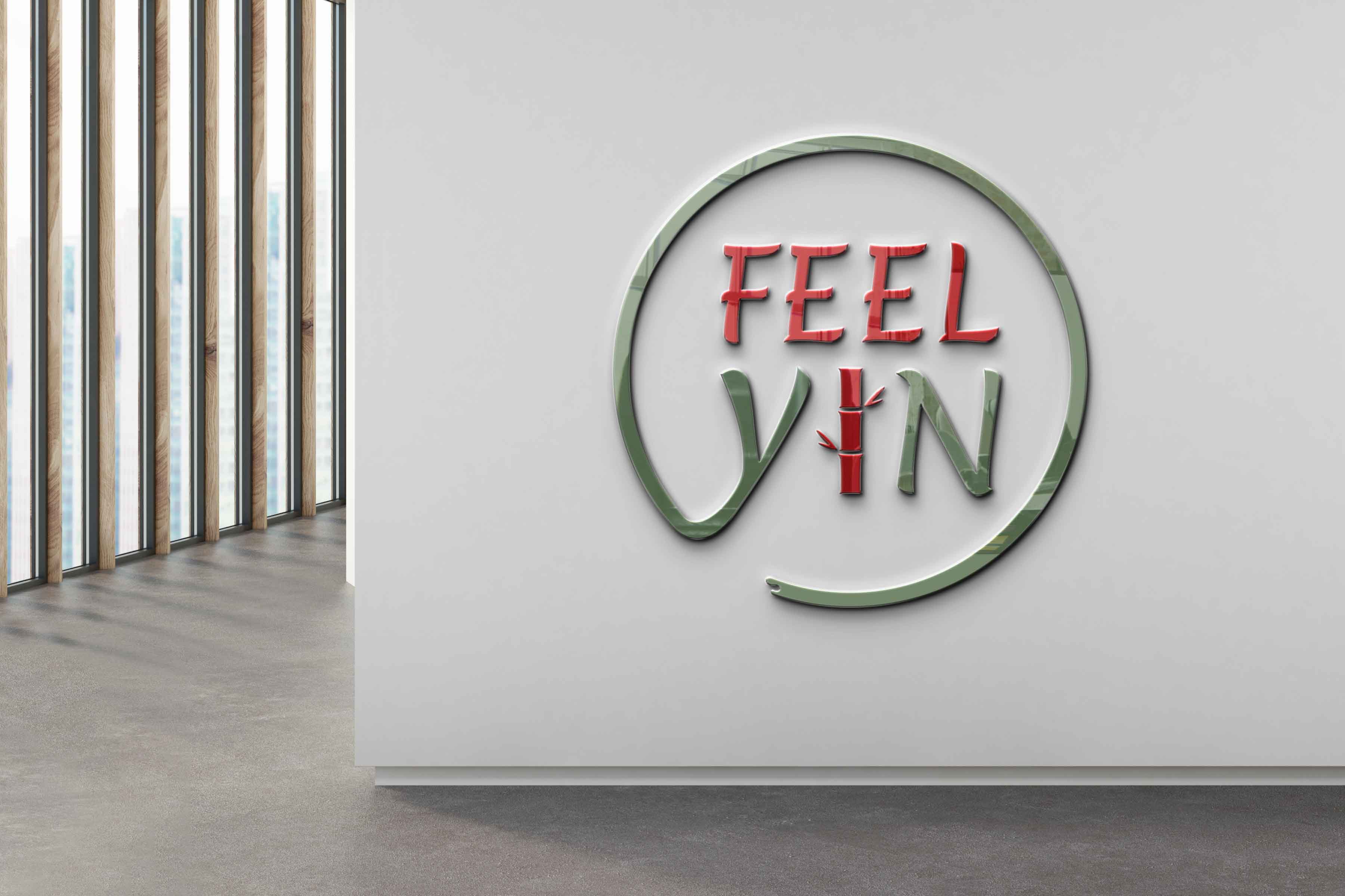
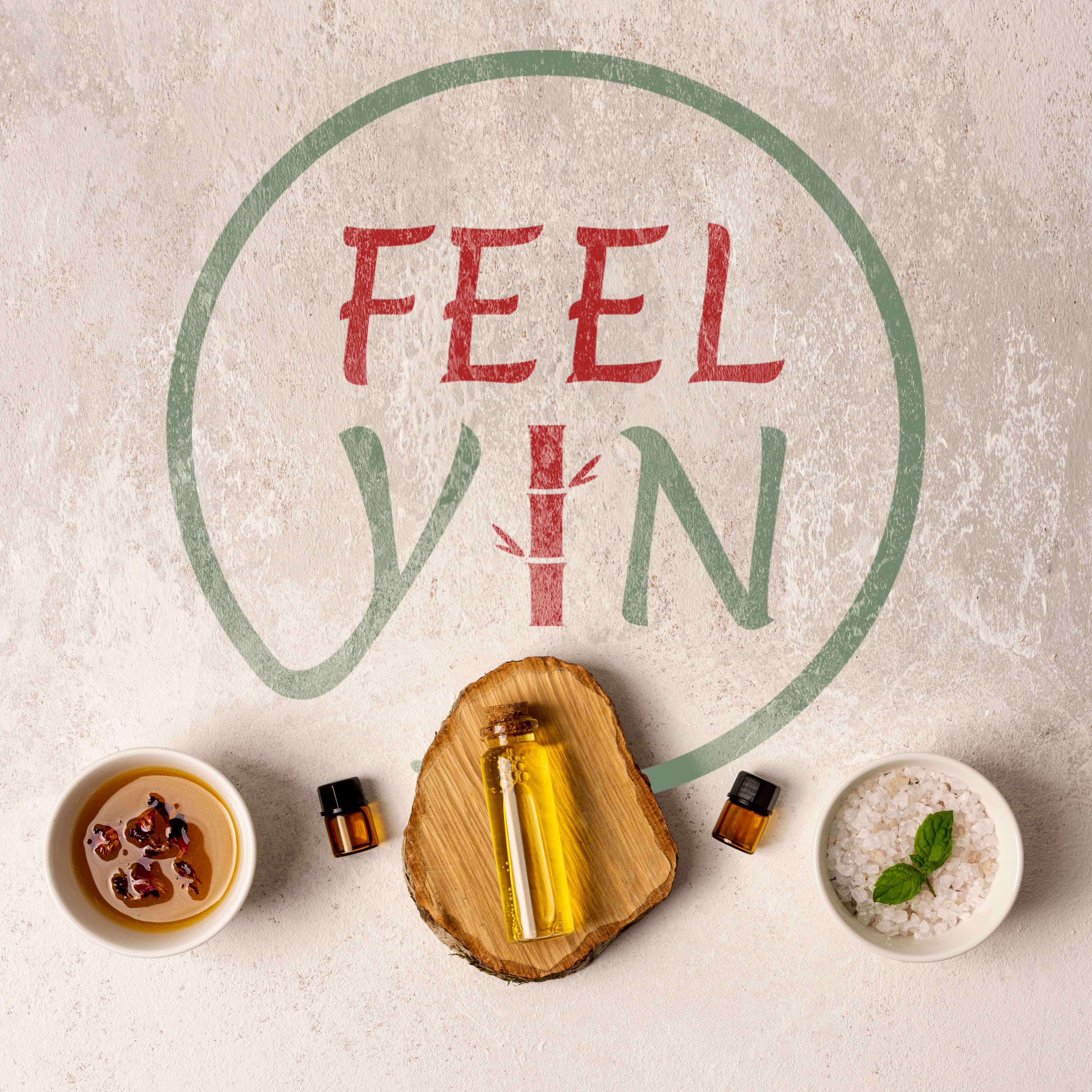
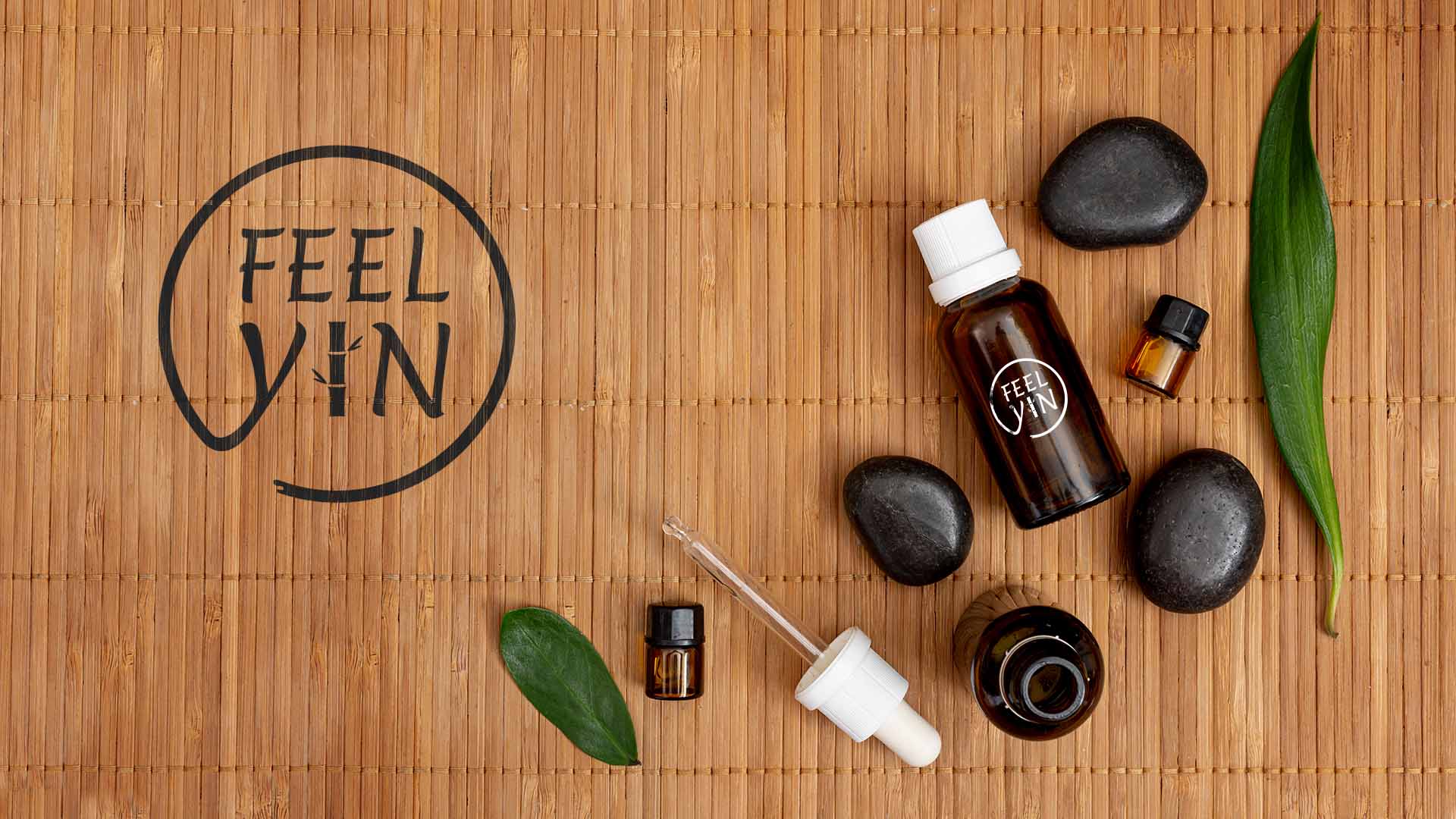
The choosen name FEEL YIN comes from the concept of harmony, longevity and motion of the mind and body. It shows the importance of the mind in the treatment of the body.
From this point I had what I needed to be able to continue to the next step, the LOGO.
The idea for the logo was to show the concept of harmony, motion and longevity.
After sketching for some time I came with a logo using 3 symbols.
A bamboo tree, a circle and the idea of inking in the circle form.
The bamboo represents the longevity. The Circle represents the Harmony. The inking represents the motion.